The ASP Report Wizard has the ability to generate simple
charts & graphs from your database. There are 3 basic types of simple
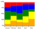
graphs. These include: The basic column graph, the stacked-type graph and the
relative area graph as shown below.
Basic Column Graph

|
Stacked-Type Graph

|
Relative-Area Graph

|
To create any of these graphs you need to do the following steps carefully:
-
Select any table that has the data you want to chart (e.g.
Products)
and click Build Report
-
Select the legend field (eg.
ProductName) and the data field (e.g.
UnitPrice)
-
Navigate to the section Add summaries to your report
-
Select the option Add Graph
-
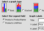
Advance to the next screen: Chart Options

-
Select the graph type you want, your legend field (
ProductName),
enter the labels for you X & Y-Axes and a title desired.
-
Select show graph only if you want only the graph to be
displayed
-
Click on Finish to display graph
Note:
-
The
SimpleGraph has a default setting of 21 legends. So if you go
over 21 records, your colors will start reapeating (after the black color).
- You can allways add filters to your report to reduce the amount of records displayed such
UnitPrice less than $50.00
See Also
...


